
Cohort analysis with R – “layer-cake graph” (part 2)
This article is originally published at https://www.analyzecore.com
We will continue to exploit a great idea of ‘layer-cake’ graph for Cohort analysis
Continue to exploit a great idea of ‘layer-cake’ graph.
If you liked the approach I shared in the previous topic, perhaps, you would have one or two questions we should answer additionally. Recall “Total revenue by Cohort” chart:

As total revenue depends on the number of customers we attracted and on the amount of money each of them spent with us, there is a sense to dig deeper.
The number of active customers can be visualized with the algorithm we used for total revenue. After we processed a large amount of data it should be in the following structure. There are Cohort01, Cohort02, etc. – cohort’s name due to customer signup date or first purchase date and M1, M2, etc. – a period of cohort’s life-time (first month, second month, etc.):

For example, Cohort-1 signed up in January (M1) and included 11,000 clients who made purchases during the first month (M1). Cohort-5 signed up in May (M5) and there were 1,100 active clients in September (M9).
Ok. Suppose you’ve done data process and got cohort.clients data frame as a result and it looks like the table above. You can reproduce this data frame with the following code:
cohort.clients <- data.frame(cohort=c('Cohort01', 'Cohort02', 'Cohort03', 'Cohort04', 'Cohort05', 'Cohort06', 'Cohort07', 'Cohort08', 'Cohort09', 'Cohort10', 'Cohort11', 'Cohort12'),
 M1=c(11000,0,0,0,0,0,0,0,0,0,0,0),
 M2=c(1900,10000,0,0,0,0,0,0,0,0,0,0),
 M3=c(1400,2000,11500,0,0,0,0,0,0,0,0,0),
 M4=c(1100,1300,2400,13200,0,0,0,0,0,0,0,0),
 M5=c(1000,1100,1400,2400,11100,0,0,0,0,0,0,0),
 M6=c(900,900,1200,1600,1900,10300,0,0,0,0,0,0),
 M7=c(850,900,1100,1300,1300,1900,13000,0,0,0,0,0),
 M8=c(850,850,1000,1200,1100,1300,1900,11500,0,0,0,0),
 M9=c(800,800,950,1100,1100,1250,1000,1200,11000,0,0,0),
 M10=c(800,780,900,1050,1050,1200,900,1200,1900,13200,0,0),
 M11=c(750,750,900,1000,1000,1180,800,1100,1150,2000,11300,0),
 M12=c(740,700,870,1000,900,1100,700,1050,1025,1300,1800,20000))
Let’s create the “layer-cake” chart with the following R code:
#connect necessary libraries
library(ggplot2)
library(reshape2)
#we need to melt data cohort.chart.cl <- melt(cohort.clients, id.vars = 'cohort') colnames(cohort.chart.cl) <- c('cohort', 'month', 'clients') #define palette reds <- colorRampPalette(c('pink', 'dark red')) #plot data p <- ggplot(cohort.chart.cl, aes(x=month, y=clients, group=cohort)) p + geom_area(aes(fill = cohort)) + scale_fill_manual(values = reds(nrow(cohort.clients))) + ggtitle('Active clients by Cohort')
And we will take the second amazing chart:
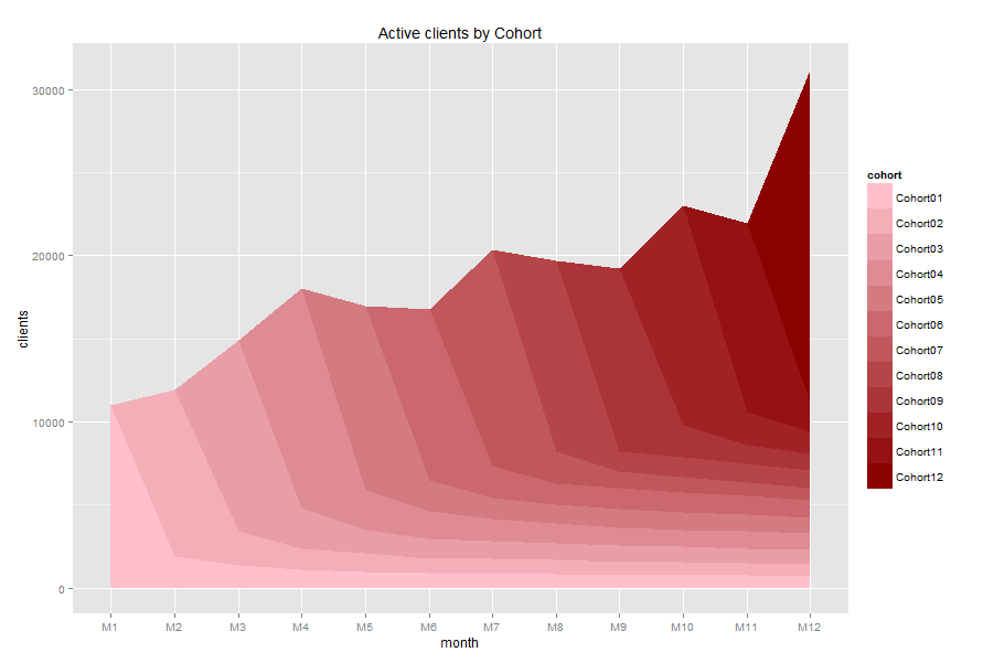
It seems like a lot of customers purchased once and gone. It can be a reason why total revenue is mainly provided by new customers.
And finally, we can calculate and visualize the average revenue per client. The R code can be as the following:
#we need to divide the data frames (excluding cohort name)
rev.per.client <- cohort.sum[,c(2:13)]/cohort.clients[,c(2:13)]
rev.per.client[is.na(rev.per.client)] <- 0
rev.per.client <- cbind(cohort.sum[,1], rev.per.client)

#define palette
greens <- colorRampPalette(c('light green', 'dark green'))

#melt and plot data
cohort.chart.per.cl <- melt(rev.per.client, id.vars = 'cohort.sum[, 1]')
colnames(cohort.chart.per.cl) <- c('cohort', 'month', 'average_revenue')
p <- ggplot(cohort.chart.per.cl, aes(x=month, y=average_revenue, group=cohort))
p + geom_area(aes(fill = cohort)) +
 scale_fill_manual(values = greens(nrow(cohort.clients))) +
 ggtitle('Average revenue per client by Cohort')
And we will take the third chart:
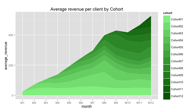
It seems like Cohort02 customers increased their average purchases during M5-M8 months. It can be a sign.
Note: The last chart shows average revenue per customer of each cohort, but it isn’t cumulative value as in previous two charts, it doesn’t show total average revenue for all clients. This chart can be used for comparing cohorts, not for summarizing. Please, don’t be confused.
The post Cohort analysis with R – “layer-cake graph” (part 2) appeared first on AnalyzeCore by Sergey Bryl' - data is beautiful, data is a story.
Thanks for visiting r-craft.org
This article is originally published at https://www.analyzecore.com
Please visit source website for post related comments.